Austin, Texas based Adlucent is a digital advertising agency that helps businesses connect with customers through paid search, product ads, mobile and other channels. Using proprietary software that identifies businesses most valuable customers, Adlucent has attracted the attention of online retailers who seek their help, and industry thought leaders who sing their praises.
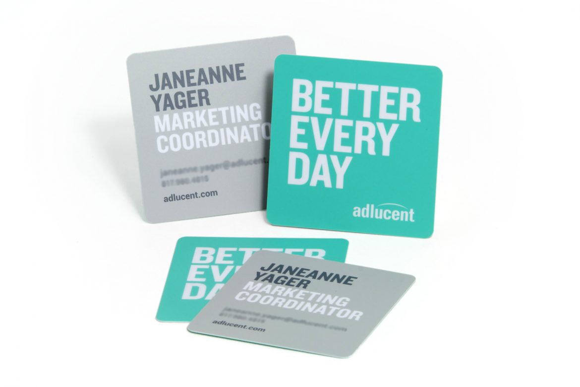
Adlucent is not a typical ad agency, and their brand identity isn’t either, which is why they chose plastic business cards. While their card’s square shape might be its most obvious deviation from the norm, there’s much more to this seemingly simple business card than meets the eye.
THINKING ABOUT THE BOX
When Adlucent thought about its brand identity, thinking outside the box meant thinking about the box. Choosing square business cards is both a visually interesting design choice, and a choice that ties into iconography found on Adlucent’s website. With custom die cut business cards, almost any shape or size can be achieved.
BELOW THE SURFACE
The number one question I ask about any marketing product is: “What does it say?” Both from a design and content perspective. The smart folks at Adlucent structured their card to make more than a shape-based impression. It was designed to communicate benefit and value by featuring the company’s motto, “better every day,” alongside their logo.
It’s important to note that Adlucent chose not to showcase their logo (an excellent logo), but to attach it to something more important: a message that communicates both their commitment and their value proposition.
The flip side of the card is their call to action. By enlarging the cardholder’s name and title, and removing any extraneous information other than their email address and phone number, the card screams “REACH OUT!”
ABOVE THE SURFACE
Adlucent went with a surface effect we like to call “crystal ink.” Crystal ink is what many people think of as spot UV — a clear coat applied to a select surface area of a card. In this case, Adlucent chose to apply crystal ink over their motto and logo, creating contrast with the card’s matte finish, and emphasis on their brand message.
STRENGTH THROUGH SIMPLICITY
Arguably, the best characteristics of this card are its simplicity and strength, embodied by strong fonts, a strong shape, and a no-nonsense frosted (matte) finish. Through simplicity, Adlucent has created a business card that exudes strength, incorporating bright colors representing bright ideas, and a desire to get “better every day.”