For most travelers, a hotel key card is a tool—a device that serves a practical purpose, receiving little attention otherwise. For the Keating Hotel in San Diego’s historic Gaslamp District, hotel key cards are more than a utility. They are an opportunity to connect guests with their brand in a way that is both tactile and visual.
About the Keating
Built in 1890, the Keating has transformed itself from a turn-of-the-century bank and office building into a top boutique property on California’s south coast. The Keating’s styling blends old and new, featuring stainless steel accents, wood furniture, and a color scheme of black, white and Ferrari red in public spaces.
Creating Contrast
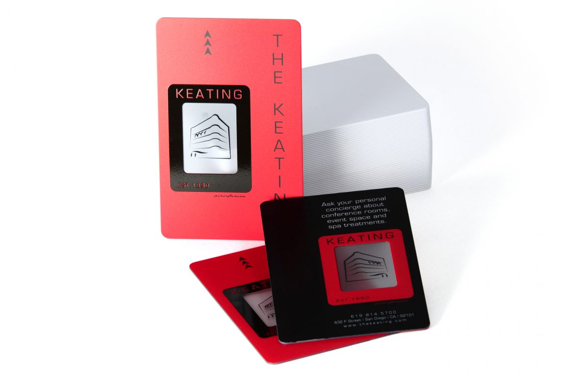
The Keating’s key card is an exercise in contrast, and contrast is what makes almost anything interesting. Contrast is the foremost design element that transforms this card from a room key to a brand element. The designers spec’d a frosted finish front and back, and a lacquer-looking crystal ink framing a modern take on the hotel’s historic exterior. Even the color schemes are reversed on each side of the card: black on red; red on black.
Clarity (in Small Amounts)
This hotel key card takes advantage of one of the most distinctive elements of plastic: clarity, and does it in the most tasteful way imaginable. You might not have guessed it, but the entire Keating key card is made of clear PVC plastic, while only a limited amount of clear plastic card material is exposed. Plastic card clarity doesn’t have to encompass the entire card canvas. Sometimes, it’s best showcased as an accent element.
Subtle Promotion
This card is about the design, but business is business, and putting a promotion in every guest’s hand is good business. That’s why there is a subtle call-to-action on the backside of the card, promoting conference rooms, event spaces, and spa treatments. Knowing that their card is more likely than the average hotel key card to be kept after the visit and shared with others, the Keating also remembered to include their phone, address and website—something not seen on many hotel key cards.
Vanishing Mag Stripe
From a design perspective, magnetic stripes can work against you. But, in choosing to swap red for black on the backside of their card, the Keating’s card designers virtually make it disappear. Another option would have been to opt for RFID key cards, removing the mag stripe entirely, and providing for greater flexibility in the placement of design elements.